Showing posts with label Final. Show all posts

Friday, February 5, 2016

The Self-Portrait Project #2

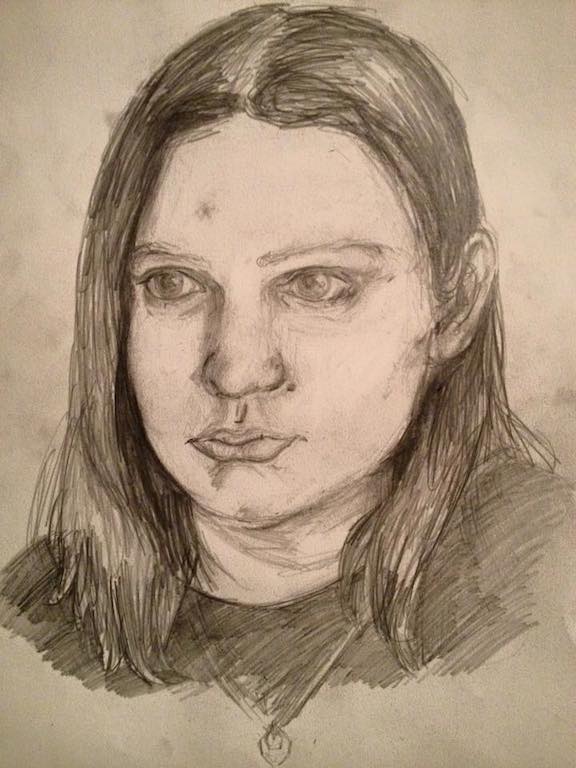
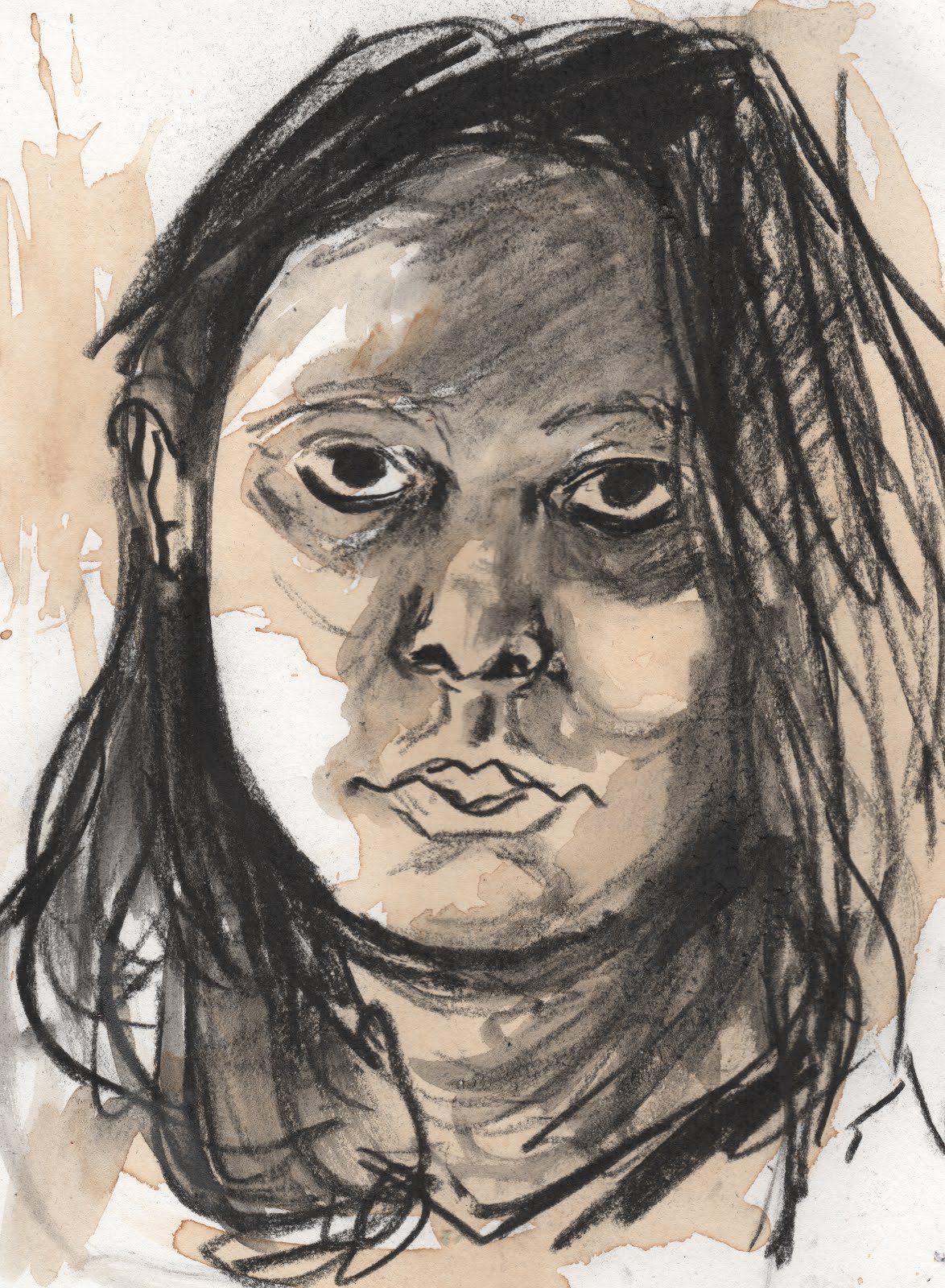
I started this portrait project in an attempt to desperately claw my way out of the empty well of confidence, and I found myself in the end pulling small buckets of water from that once empty well. Not only did this project get me motivated to create art that I enjoyed making again, it reminded me that I CAN create the art that I enjoyed. Being in an artist/writers block is devastating for someone who is already pushing against a storm with liquid doubt up to the waist.

The next theme amongst the portraits I noticed was my reaction to each medium/material. The more I used bright colors, the happier I became and more encouraged I was to continue creating. When I tried to make a serious, realistic piece I just got frustrated and ended up making angry portraits with my frustration at not having the perfection I desire.

In frustration:


Slowly getting out of anger:


Then just fun things:


This helped me out a lot! No I didn't produce the absolute best work, but I created work that led me back on the path I was on before the artist block.

Monday, December 7, 2015

Commission for My Boss!

Just a graphite drawing. Will I make this into a color final? Nah, I think I'll leave it the way it is. I'll have enough forest pieces anyway haha.


Thursday, December 3, 2015

Building a Portfolio? Uh Oh

Out of my entire website, I found only three pieces that has done anything to get into my actual portfolio. I guess they're right in saying it takes a lot of failure to gain any kind of success (whoever they are ha.)

My illustration work has disappointed me.

But! When I look and compare the work I was doing just a year ago, a lot has changed. I have gotten more accurate and I pay more attention to detail. I had thought, and this is a silly thought, that illustration was supposed to be "made up" or something that my mind has poured out on a surface without any reference. Well, it's not too surprising that I thought this. Going to college with many different artists, the fine artists and the illustrators were almost at war with each other in the ideas for what is a true art piece. As a fine artist and oil painter first, I thought that if I used reference the image would be too realistic and traditional to be an illustration.

Blah no!

Again, silly thought and perhaps thinking this way has made my art suffer. Any readers out there, if you have a stable idea of what art is rethink it! You might find a whole new reality.

To keep myself from spiraling down into a dark abyss of the stereotypical, almost archetypal, artist defeated depression, I started looking around for simple explanations for building a portfolio. I found this blog post helpfully breaking down what my portfolio needed to accomplish. I've read this one before however it's still helpful. Both of these illustrators seem to have their stuff together, and if there's any way of learning how to put a portfolio together and be professional, looking at successful illustrator portfolios is the best.

In the end, out of the 23 pieces on my website, and many others not on my website, these three are the only ones that are close to portfolio worthy. That's okay. If I can make three already then I can make three more.

Saturday, May 10, 2014

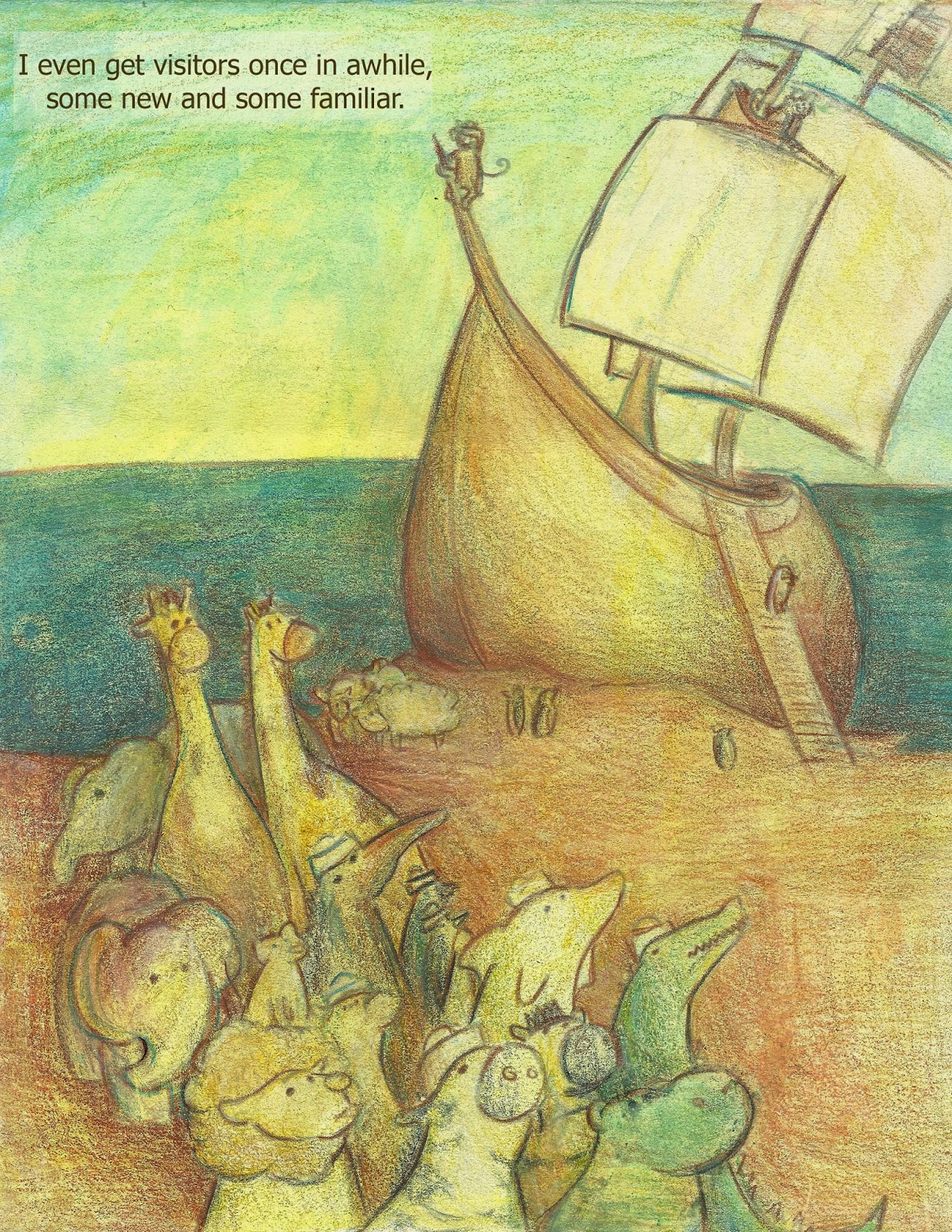
More work on this

 Back to working on this, I realized the print wasn't quite right. It was too yellow, the font wasn't the color I wanted and the overall image just fell short when I printed it. SO...I started over again almost anyway.

I first created a layer of soft pink in photoshop over the entire composition, went on to choose the color I wanted for the font and actually typed the edited words/changed the position of them a little so they didn't seem so tightly packed in that upper left hand corner. I might change it later because of the monkey, but right now I'm not bothered by the connection of the words to the image.


I then went on and created a transparent layer of turquoise to see if the pink was enough to hold over the yellow so that the piece wouldn't turn green. It worked a bit, but it lost it's sharp outlines in the process and I ended up cutting the foreground and middle ground from another copy and pasting it to the final, then digitally erasing the two images so they blended together. This is my favorite copy so far but I'm afraid if I look at it too long it'll never be considered finished. haha.