Tuesday, May 27, 2014
When I first started this piece, I wasn't really sure where I wanted to go with it. I had an idea to make a cold place and a fire too small for Lue to be comforted by it. So I started out rather abstractly and put it on Facebook to see if people even knew what it was. Everyone said the fire looked like a chicken and they didn't understand the scenario (and it does look like a chicken!) Any way, went back to it and planned the tone, light source, direction, and generally the composition. Came out with the next two.
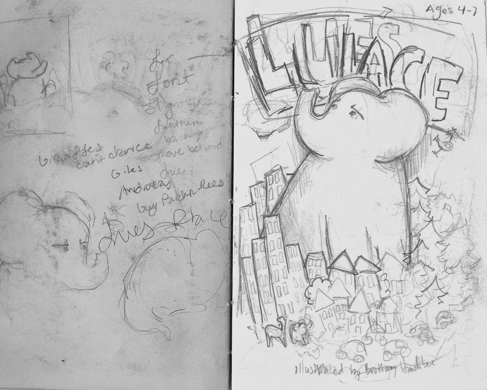
Because I have a serious problem with tone and light, I always need to the color in black and white. The one on the left is the composition I made with graphite so I already made the tone and the one on the right I tried with color. As you can see the tone gets lost again. So I'm drawing it again, this time with the black and white in mind and the idea to not make the colors muddy.
Tuesday, May 20, 2014
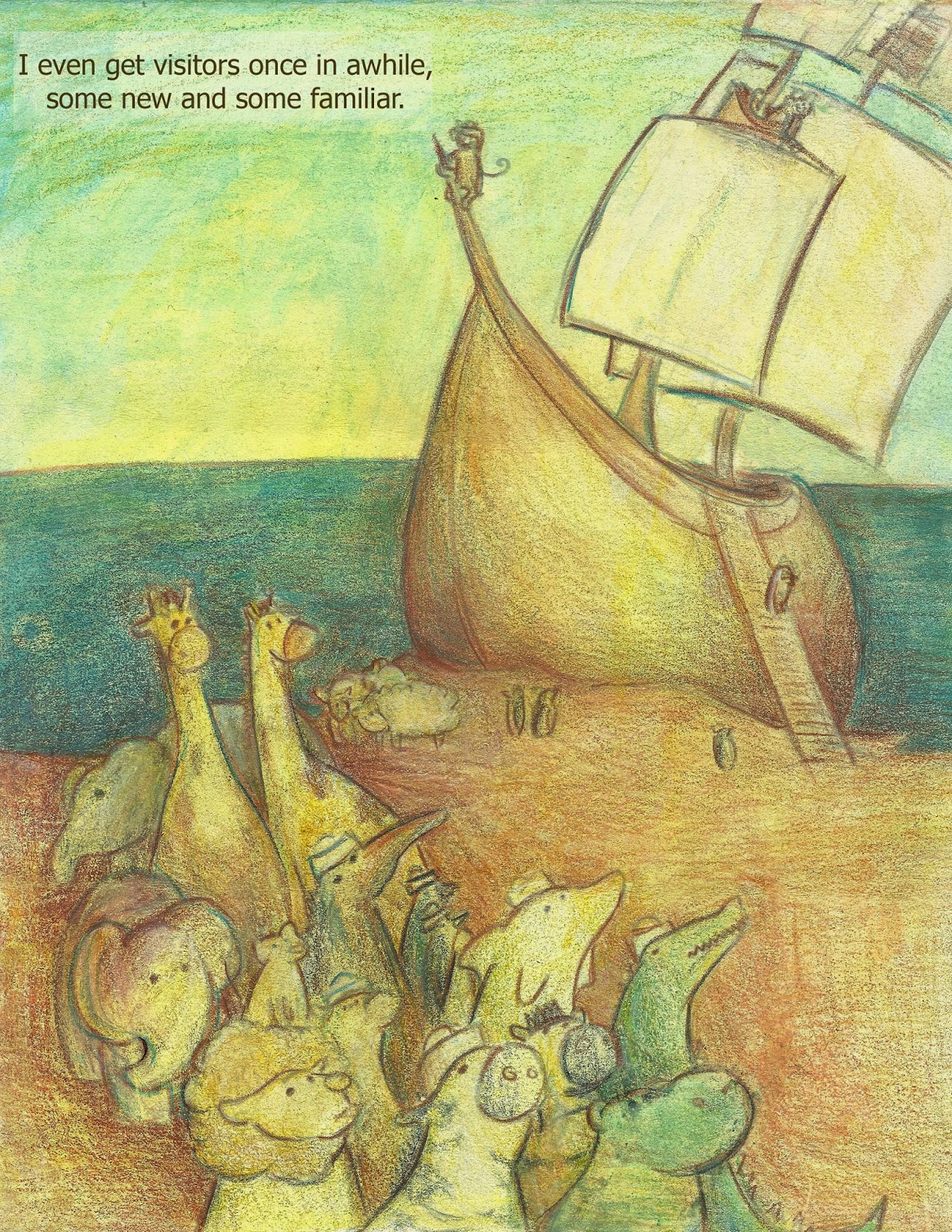
hahaha...ha. I'm FINISHED. I declare it now before I decide I'm not and end up trying to fix something else. I added more lights, more darks only just a bit because I didn't want heavy contrast in lights and darks. The sea is the darkest on the finished one (the left one! >_<) and the lightest points bounce back and forth between the ship's sail and through the animals. I didn't want a light focal point and a lot of the time the lightest may come with the object in the foreground, I wanted the focus back and forth in a fluent motion between the background and the foreground. I usually focus on the fact that an image is a flat space so many times I will forget that tone matters. it does, i just forget sometimes is all...
Thursday, May 15, 2014
Wednesday, May 14, 2014
Lue's Place edited again, this time with 283 words...woopwoop!
Hello I’m Lue and this is how suddenly one day I just grew. My roof became a hat, my house became a box and when the neighbors started running I needed to find a place to fit.
That place definitely wasn’t the city. It’s a bit crowded, it’s a little gray. I tried the countryside, stomping prints in the patterned fields. Maybe a place with many trees could fit? No. I just scared the squawking birds away.
Searching took days, nights, and in my travels I found some pretty big places that would've worked, if those places weren’t really chilly or dry and sweaty. Didn’t work for me. Eventually I reached the sea and indeed I did fit there, though I was careful not to squash the crawling critters as I began to swim. The sea became my very own swimming pool with large squiggly fish along the way.
I may have startled some sailors who were also searching for new lands. In the end they were happy to have company of a fellow traveler across the big blue as they told me a tale of a giant island said to be further along.
The tale seemed true because the sand I landed on was different, it was right. The moon’s light showed me the giant island that was big enough to fit.
The Island’s plants towered over my head and it’s fruit filled me full. With the trees I built a new home, one where the roof never became a hat again. I even get visitors once in awhile, some I haven’t met, some I have. They call this place, “The Big Elephant’s Island”. I just call it Lue’s Place.
Lue in box
Finally got the drawing down (I don't know why it's gray on here but whateves, just a sketch anyway) As you can see I had to go back in photoshop and clean some of the scan mess on there. You'll be able to see it better on my Cargo collective, Brittanny Handiboe. But hey, at least I managed to fix the composition!
Pages 10/11 have been one of the most difficult pages out of the whole dummy. That may be because it was among the first compositions like the swimming one. This sketch is how I chose the color for Lue, him being the tropical blue amongst the heat of orange. The color blue has always represented a creature who liked to think outside the box (or maybe just daydream, that too) so I thought I'd depict Lue being blue and growing outside of his box of a house.
I tried to create a mixed media sketch, adding the acrylic and the colored pencil with the graphite. I had used this mix of material before and it was successful, but this being a big more ..."happy" it just didn't work out.
Here is the one with just colored pencil and acrylic, color testing Lue's contrast to his surrounding but also trying to make the image flow so I decided to use some yellow as the first layer of color...bad idea really. Not working.
Saturday, May 10, 2014
More work on this
Back to working on this, I realized the print wasn't quite right. It was too yellow, the font wasn't the color I wanted and the overall image just fell short when I printed it. SO...I started over again almost anyway.
I first created a layer of soft pink in photoshop over the entire composition, went on to choose the color I wanted for the font and actually typed the edited words/changed the position of them a little so they didn't seem so tightly packed in that upper left hand corner. I might change it later because of the monkey, but right now I'm not bothered by the connection of the words to the image.
I then went on and created a transparent layer of turquoise to see if the pink was enough to hold over the yellow so that the piece wouldn't turn green. It worked a bit, but it lost it's sharp outlines in the process and I ended up cutting the foreground and middle ground from another copy and pasting it to the final, then digitally erasing the two images so they blended together. This is my favorite copy so far but I'm afraid if I look at it too long it'll never be considered finished. haha.
Friday, May 9, 2014
Swimming with Lue
The journey of this piece is a long tale, I will scan all the sketches! Also this is my second composition that gave me the inspiration to write the story so I view this as the most important spread of the book, the turning point from scaring away the other animals he meets to them actually inviting him to travel along.
Thursday, May 8, 2014
Lue's Place edit 1
The goal today is to complete an edited rough draft of the manuscript for "Lue's Place". I also need the correct format
ANYWAY here is the short, 251 word children's book I'm writing. It is the cause of this blog and so it makes sense to add it. Should I add more to it? Or should I keep the simplicity, letting the illustrations do most of the talking?
Lue’s Place
Hello I’m Lue and this is how suddenly one day I just grew. My roof became a hat, my house became a box and when the neighbors started running, I needed to find a place to fit.
That place definitely wasn’t the city. It’s a bit crowded, it’s a little gray. I tried the countryside, stomping prints in the patterned fields. Maybe a place with many trees could fit? No. I just scared the squawking birds away.
Searching took days, nights, and in my travels I found some pretty big places but those were really chilly or dry and sweaty. Eventually I reached the sea and indeed I did fit there. It became my swimming pool with large squiggly fish along the way.
I may have have startled some sailors who were also searching for new lands. In the end they were happy to have company of a fellow traveler across the big blue as they told me a tale of the giant island said to be further along.
The tale seemed true because the sand I landed on was different, was right. The moon’s light showed me the giant island that was big enough to fit. It’s trees towered over my head and it’s fruit filled me full.
I built a new home, one where the roof never became a hat again. I even get visitors once in awhile, some I’ve never seen and some familiar. They call this place, “The Big Elephant’s Island”. I just call it Lue’s Place.
Tuesday, May 6, 2014
Lue's in a box
Piecing together a colored spread that's double the size of my scanner takes some time. Then after I realized that each bit needed to be scanned again and...well that just took more time of course XD. PROGRESS!
I got to this point and I think to myself, "Oh yeah clone stamp won't fix all my problems
Yep, that's exactly how I feel buddy...gonna hafta draw it again.
"
Sunday, May 4, 2014
sketch to "finish"
It's good to get an idea down first with simple shapes. This thumbnail was the start of a composition that I feel is complete and it happened by focusing on the need to have these "shapes" looking up in awe and gathering around something from out of view.
These shapes are animals looking up at the big elephant Lue (which is shown on the right). I just needed to change direction and bam! I got the composition down that I had envisioned.
After a few more chicken scratches that I won't even bother putting on here, I created the "final" black and white graphite composition.
Moving on to color, I started out with a simple pale yellow wash of acrylic then mapped out the composition with colored pencil.
And finally, with a couple more layering of acrylic and colored pencil, I managed to get this result:
I think it was worth the numerous amount of paper and hours to complete. I just need to be more patient. :)
Saturday, May 3, 2014
Title page sketch
The title page for Lue's Place had another set of thumbnails, sketches, and different compositions.
These are the two that I managed to get out in sketchbook. Then I created the pen version to see if I can get a subtle value to it.
The final, or at least for now.
blah blah blah
So I decided to get another blog simply because my old one was just documenting my work for me and I never really got on there to update anything. "I have a cargo collective and a Facebook, why should I?"was my opinion at the time and now that's changed. This blog is called "Draw It Again" simply because I draw compositions over and over and over again before I get close to the finish. It is a progress blog, documenting my journey through failure to achieve a bit of success. The project I'm working on now is a book dummy that I've begun to finish, Lue's Place.
This one is has changed a bit already
and again with the full composition on the page.
Of course this doesn't count the endless thumbnails and sketchbook/printer paper drawings. bleh.
Subscribe to:
Posts (Atom)