
I first created a layer of soft pink in photoshop over the entire composition, went on to choose the color I wanted for the font and actually typed the edited words/changed the position of them a little so they didn't seem so tightly packed in that upper left hand corner. I might change it later because of the monkey, but right now I'm not bothered by the connection of the words to the image.

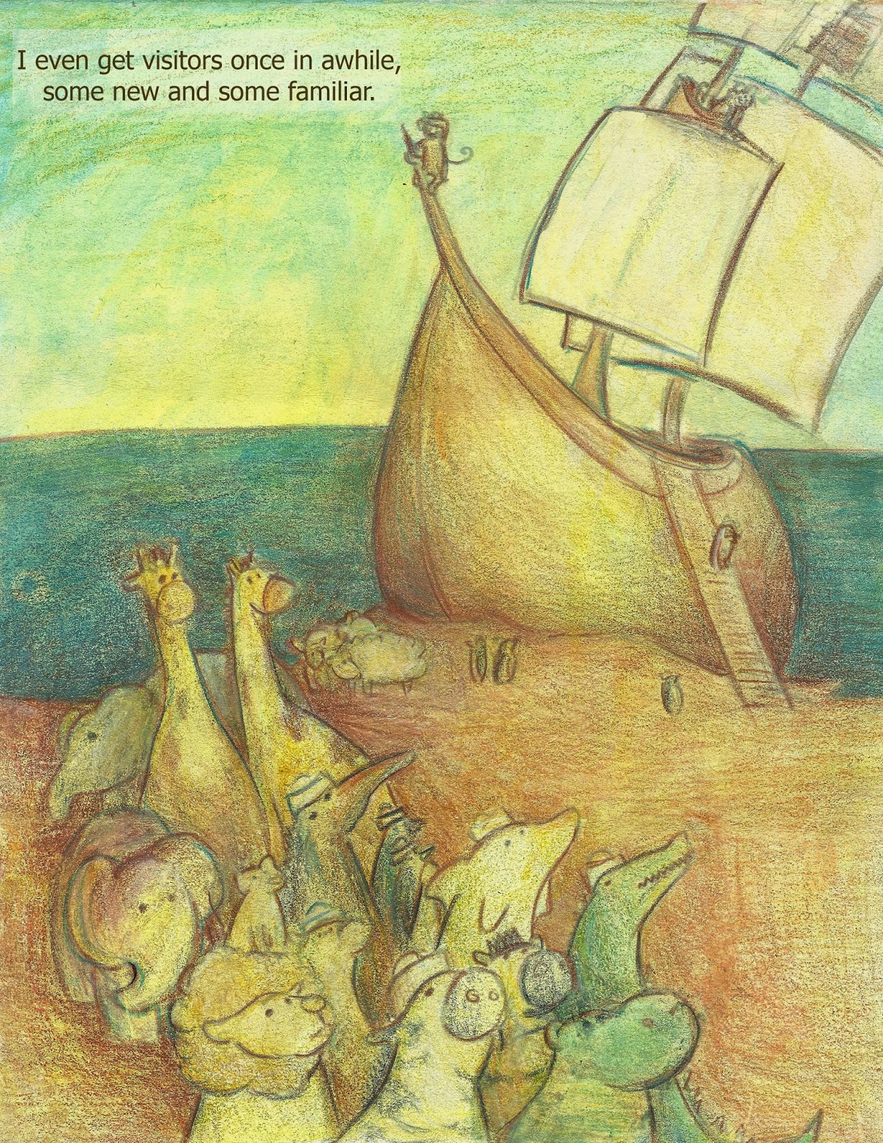
I then went on and created a transparent layer of turquoise to see if the pink was enough to hold over the yellow so that the piece wouldn't turn green. It worked a bit, but it lost it's sharp outlines in the process and I ended up cutting the foreground and middle ground from another copy and pasting it to the final, then digitally erasing the two images so they blended together. This is my favorite copy so far but I'm afraid if I look at it too long it'll never be considered finished. haha.

No comments:
Post a Comment